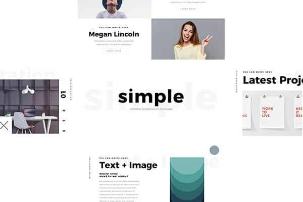
Presentation slides are a crucial tool in conveying information and messages to an audience. However, it is common for presenters to overload their slides with too much information, which can overwhelm and disengage their audience. This is where the art of minimalism in presentation slides comes in.
What is Minimalism?

Minimalism is a design trend that focuses on simplicity and the use of a minimal amount of elements to convey a message or idea. In presentation slides, minimalism involves using only the necessary information and visual elements to convey the key message or idea to the audience.
The Benefits of Minimalism in Presentation Slides
There are several benefits to using minimalism in presentation slides:
- Clear and concise message: By using only the necessary information and visual elements, the message of the presentation is clear and concise, making it easier for the audience to understand and remember.
- Increased audience engagement: Minimalist slides are less overwhelming and distracting, which can increase audience engagement and focus on the presenter’s message.
- Professional and modern look: Minimalist design is a popular trend in modern design, giving presentations a professional and contemporary look.
Tips for Creating Minimalist Presentation Slides

Here are some tips for creating minimalist presentation slides:
- Limit the amount of text: Use short phrases or bullet points to convey key messages instead of long paragraphs.
- Use high-quality images: Use relevant and high-quality images to support the key message or idea of the presentation.
- Choose a simple color scheme: Use a simple color scheme with a limited number of colors to maintain a clean and modern look.
- Use white space: Leave enough white space on the slide to avoid overcrowding and make the information easier to read.
- Focus on the key message: Keep the focus on the key message or idea of the presentation, and remove any unnecessary information or elements.
The art of minimalism in presentation slides is all about using only the necessary information and visual elements to convey the key message or idea to the audience. By adopting a minimalistic approach, presenters can create clear, concise, and engaging presentations that are more likely to be remembered by the audience. Remember to limit the amount of text, use high-quality images, choose a simple color scheme, use white space, and focus on the key message to create effective minimalist presentation slides.

