
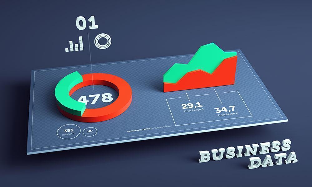
Data visualization refers to the process of representing data in a graphical or pictorial format. It allows data analysts and business professionals to communicate complex information in a clear and concise manner. In today’s world, where data is abundant and constantly being generated, the ability to make sense of it all has become more crucial than ever. And this is where data visualization comes into play.
Why is Data Visualization Important?

Data visualization makes it easier for people to understand and interpret large amounts of data. It helps to identify patterns, trends, and outliers that might not be immediately apparent when looking at raw data. It also allows users to explore data in different ways, such as filtering, sorting, and drilling down into specific details.
Data visualization is particularly important in business settings, where decision-makers need to quickly grasp the key insights from complex data sets. By presenting data in a clear and compelling way, it becomes easier to make informed decisions that drive business growth and success.
The Benefits of Data Visualization
There are several benefits to using data visualization to present information:
- Increased Clarity: Data visualization helps to simplify complex data and make it easier to understand.
- Better Decision-Making: By presenting data in a clear and concise manner, decision-makers can make more informed choices.
- Improved Communication: Data visualization makes it easier to share information with others, whether it’s within an organization or with external stakeholders.
- Identify Trends and Patterns: Visualizing data can help to identify trends and patterns that might not be immediately apparent when looking at raw data.
- Save Time: Data visualization can save time by presenting information in a way that is easy to understand and interpret.
Tools for Data Visualization

There are many tools available for data visualization, ranging from simple spreadsheets to complex software programs. Some of the most popular tools include:
- Excel: Microsoft Excel is a popular tool for data visualization, as it allows users to create charts, graphs, and other visualizations within the spreadsheet itself.
- Tableau: Tableau is a powerful data visualization tool that allows users to create interactive dashboards and visualizations.
- R: R is a programming language that is widely used for statistical analysis and data visualization.
- Python: Python is another programming language that is commonly used for data analysis and visualization.
Tips for Effective Data Visualization
To create effective data visualizations, it’s important to keep the following tips in mind:
- Choose the Right Visualization: Different types of data require different types of visualizations. Choose the visualization that best suits the data you are working with.
- Avoid Clutter: Keep your visualizations clean and simple. Avoid clutter and unnecessary details that can distract from the key insights.
- Use Color Strategically: Color can be a powerful tool in data visualization, but it should be used strategically. Choose colors that are easy on the eyes and that highlight the key insights.
- Label Your Visualizations: Make sure your visualizations are clearly labeled and easy to understand. Use descriptive titles and labels to help viewers understand what they are looking at.
- Test Your Visualizations: Before sharing your visualizations with others, test them out to make sure they are clear and easy to understand.
Data visualization is a powerful tool for communicating complex information in a clear and concise manner. By using the right tools and following best practices, data analysts and business professionals can create compelling visualizations that drive informed decision-making and business success.